
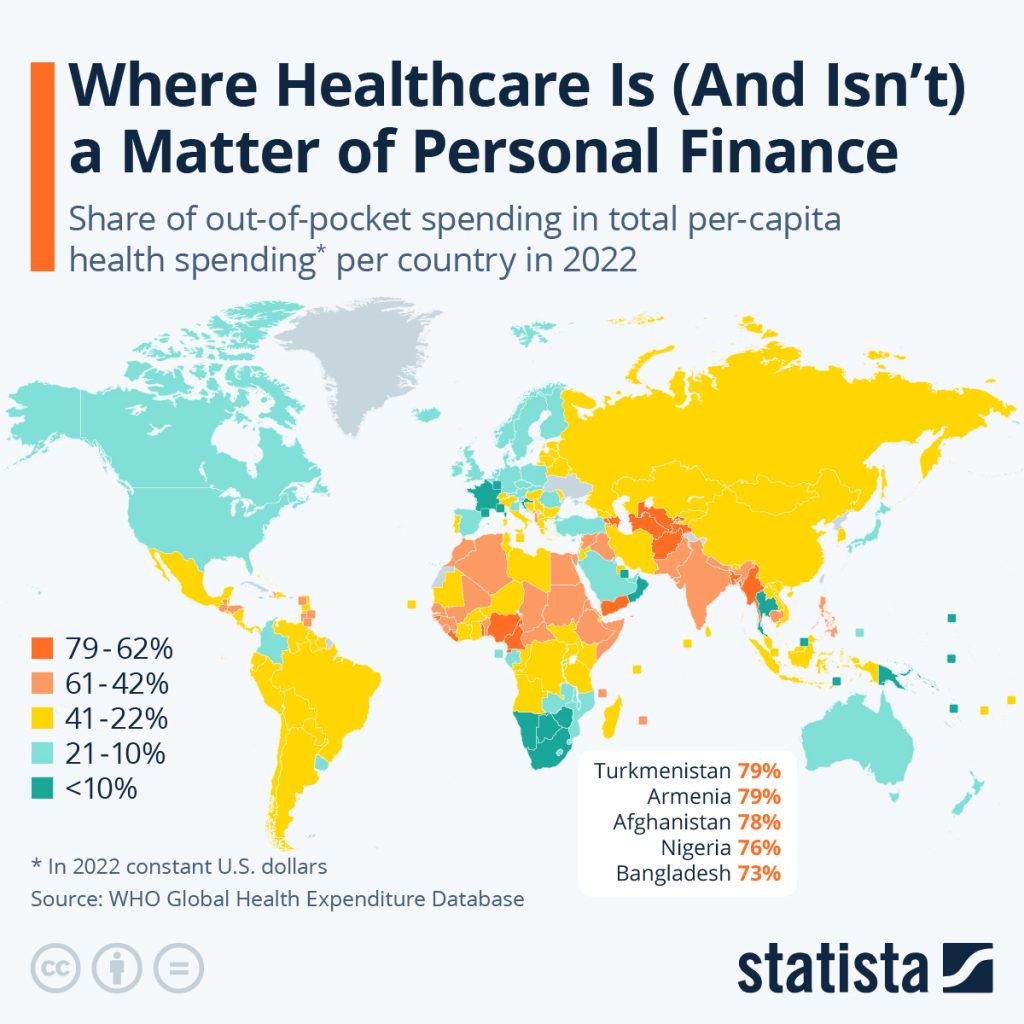
Who can explain this graphic to me?
My understanding was that Americans’ out-of-pocket spending on healthcare is exceedingly more expensive compared to European countries.
Does that mean the percentage of out-of-pocket costs is low in the US but the overall dollar value is still far higher?
This cartoon was first published by SKS Cartoon. Please follow and subscribe on Twitter and Instagram.